
Dashboard Mockup
Initial Sketches
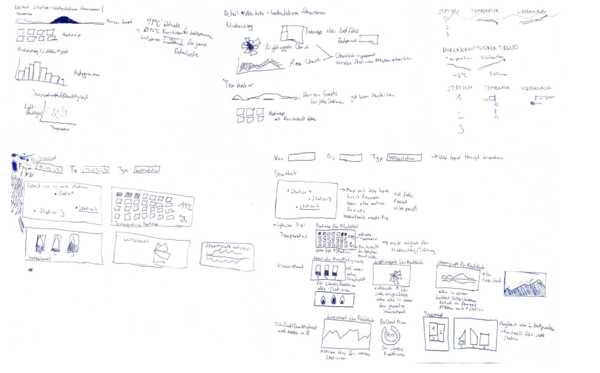
The design process began with hand-drawn sketches exploring various layout and visualization options. These initial drafts helped form the foundation of the dashboard prototype, experimenting with different ways to display data for clarity and usability.
First Clickdummy
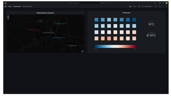
The first digital prototype, created as a basic "clickdummy", was very limited in functionality. The layout was basic, and while a heatmap was included, the overall design was revised significantly after this initial iteration
Second Prototype Overview
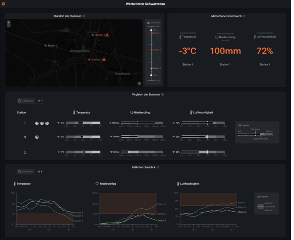
This version included a more advanced overview page with a map panel, extreme values panel, bullet graph panel, and multi-line charts. "Small multiples" visualizations were also used, which is clearly visible in the bullet graph panel. Essentially, this was the final version of the click dummy prototype, which was used for the user studies and on which the final Grafana panels were developed.
Detail Page

In the second, final prototype, detail pages were also introduced where individual data attributes for each station could be viewed in more detail. This allowed users to explore specific weather data for different locations more closely. The panels intended for this were the min-max chart and the calendar panel.