Grafana Plugins
The following panels (independent Grafana plugins) were developed as part of the project. This list provides only a brief overview and the option to download the completed panels. For more detailed information, please refer to the linked documentation for the panels.
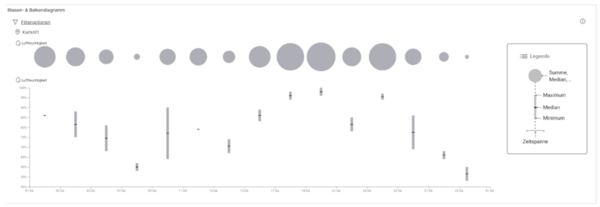
Each bar and circle represent a time span between two points on the horizontal axis. The displayed time frame, attributes, and station can be adjusted in the filter options.
The radius of the circle represents the sum, median, or average of the selected attribute, with the chosen calculation being adjustable in the filter options.
The corresponding bar represents the maximum and minimum within the respective time frame, with a line indicating the median. Hovering over the bars and circles will display more detailed data in the tooltip.
Details:
For more detailed information on the functionality and requirements of this panel, please refer to the documentation.
Download:
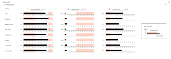
In the Bullet Graph visualization, up to three measurement values from the selected data sources are displayed. The black bar represents the average over the chosen time period, while the orange areas indicate the defined risk zones. A maximum of three attributes per device/station can be displayed simultaneously in the Bullet Graph panel.
The gray arrow next to the average value in the Bullet Graph indicates whether the current value has increased or decreased compared to the same time period in the past.
In the top left corner of the panel, filter options for the displayed Bullet Graphs can be adjusted. These options include the time period shown and the selected data sources. Using the arrows next to the attribute dropdown list at the top of each attribute column, the entire table can be sorted by that measurement value.
Details:
For more detailed information on the functionality and requirements of this panel, please refer to the documentation.
Download:
smartcomm-bulletgraph-panel.zip
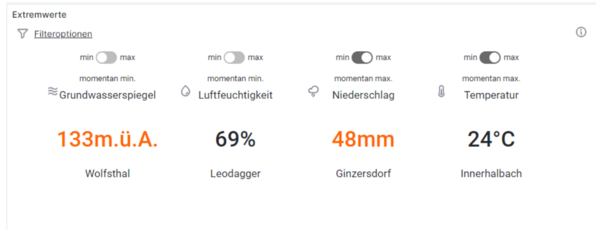
In the Extreme Values panel, the most recent measurements are displayed, regardless of the data source.
The button above each attribute allows switching between the data source with the currently highest or lowest value. Measurement values marked in orange are within the defined risk zone.
The filter options allow you to specify which stations and attributes should be considered.
Details:
For more detailed information on the functionality and requirements of this panel, please refer to the documentation.
Download:
smartcomm-extremevalues-panel.zip
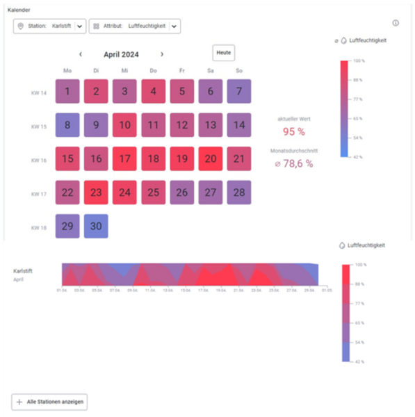
The Calendar panel consists of a calendar that functions as a heatmap for the displayed month and a horizon chart that shows the detailed temporal progression of the measurement value over the month. In this panel, only one attribute/measurement value can be displayed at a time.
The calendar acts as a heatmap – the color of each day is based on the daily average, which can be read from the color legend located to the right of the calendar.
Below the calendar is the section for the horizon charts. These charts compactly display the temporal progression of the measurement value. They consist of up to four horizontal bands, each representing a value range that can be interpreted from the color legend. The bands are stacked for compact visualization, with the rear band representing the lowest value range and the front band representing the highest.
Details:
For more detailed information on the functionality and requirements of this panel, please refer to the documentation.
Download:
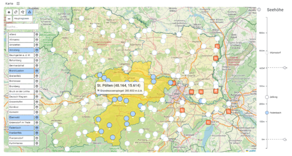
In the map visualization, available data sources and their current values can be displayed based on coordinates (latitude/longitude) and selected using various options.
Outlined regions help with orientation and make selection easier. Additionally, there is a display of the altitude and an overview of sources with values that fall within their risk zone.
Details:
For more detailed information on the functionality and requirements of this panel, please refer to the documentation.
Download:
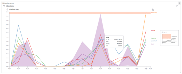
In the line chart, the available data sources and the progression of the measurement values over the available time period can be displayed and adjusted using various filter options. For each available measurement, a line chart is drawn, and within this visualization, a line is drawn for each available data source.
This line visualizes the average trend of the values over the selected time period. When hovering over a line, an area appears, with its upper and lower bounds representing the respective maximum and minimum values over the period.
The configured threshold per attribute is displayed in the chart as an orange-shaded area.
Details:
For more detailed information on the functionality and requirements of this panel, please refer to the documentation.
Download:
smartcomm-multiplelinechart-panel.zip

