VisOnFire. Understanding and visualizing workflows

Visual Analysis of Large and Heterogeneous Scientific Workflows for Analytical Provenance. - A new visual forensic tool realizes the visualisation of data analysis workflows and helps to increase the reproduciblity of studies.
Copyright: JKU Linz/Stefan Luger

The complex analysis of big amounts of data

Over the last few years, many fields of science have been confronted with tremendous amounts of data that are growing rapidly. Large-scale experiments are carried out as scientific workflows on powerful server infrastructures, combining data-transformation and analytic operations. Often groups of researchers from different organizations collaborate on administrating and constantly revising and changing those workflows. Therefore, it is more difficult to comprehend what kind of changes and variations have taken place and how they might have influenced the results. Reproducibility of results is an essential aspect in this context since sustainable scientific progress is only possible if researchers can trust previously published results, which they then can use a fundament for advancing their field. However, to increase the trustworthiness and scientific value of such studies in the future, developing novel approaches that implement traceability and reproducibility is of utmost importance.

How to understand and visualize scientific workflows
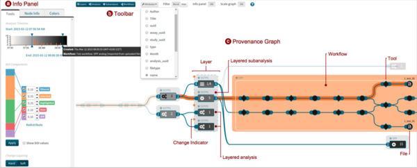
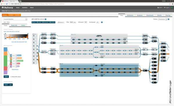
The key to traceability and reproducibility lies in the collection of information about the processed data, the applied analysis steps, and their parameters over time. We refer to this bundle of information as provenance graph. Right now, it is extremely difficult to find out which changes occurring at the level of the input data, the workflow itself and its parametrization in the context of large-scale projects actually caused variations in the output using existing provenance approaches. The primary aim of the project is to develop an innovative visual forensic solution for scientific workflow provenance graphs, combining the following features:

  1. scalable workflow visualization methods
  2. change metrics for heterogeneous data
  3. advanced visual comparison techniques.

Traceability and reproducibility

The primary goal of the proposed research project is to implement provenance at all levels, allowing analysts to gain a deeper understanding of the workflow, changes applied to the workflow, and how they influence the results. Therefore, this project will have a positive impact on a variety of fields and disciplines.

Links

Project Website

Copyright: JKU Linz/Stefan Luger

Copyright: JKU Linz/Stefan Luger

Publications

Aigner, W. (2023, May 22). Visualization Literacy & Onboarding. VRVis Forum #176 | Digital Humanism, Vienna, Austria. https://www.vrvis.at/news-events/events/176-digital-humanism
Stoiber, C., Emrich, Š., & Aigner, W. (2023). Design Guidelines for Visualization Onboarding Concepts in Data Journalism [Vortrag]. STS Conference, Graz. https://stsconf.tugraz.at/
Horak, T., Aigner, W., Brehmer, M., Joshi, A., & Tominski, C. (2022). Responsive Visualization Design for Mobile Devices. In B. Lee, E. K. Choe, P. Isenberg, & R. Dachselt (Eds.), Mobile Data Visualization. CRC Press; 10.1201/9781003090823-2. https://www.routledge.com/Mobile-Data-Visualization/Lee-Dachselt-Isenberg-Choe/p/book/9780367534714
Stoiber, C., Grassinger, F., Pohl, M., Stitz, H., Streit, M., & Aigner, W. (2019). Visualization Onboarding: Learning How to Read and Use Visualizations. IEEE Workshop on Visualization for Communication. IEEE Symposium on Information Visualization, Vancouver, BC, Canada. https://doi.org/10/gh38zd
Stoiber, C., Wagner, M., Ceneda, D., Pohl, M., Gschwandtner, T., Miksch, S., Streit, M., Girardi, D., & Aigner, W. (2019). Knowledge-assisted Visual Analytics meets Guidance and Onboarding. IEEE Application Spotlight. IEEE Symposium on Information Visualization, Vancouver, BC, Canada.
Stoiber, C., Rind, A., Grassinger, F., Gutounig, R., Goldgruber, E., Sedlmair, M., Emrich, S., & Aigner, W. (2019). netflower: Dynamic Network Visualization for Data Journalists. Computer Graphics Forum (EuroVis "19), 38. https://doi.org/10/ghm4jz
Dahnert, M., Rind, A., Aigner, W., & Kehrer, J. (2019). Looking beyond the horizon: Evaluation of four compact visualization techniques for time series in a spatial context. ArXiv:1906.07377 [Cs]. http://arxiv.org/abs/1906.07377
Gäbler, J., Winkler, C., Lengyel, N., Wallner, G., Aigner, W., Stoiber, C., & Kriglstein, S. (2019). Diagram Safari: A Visualization Literacy Game for Young Children. Proceedings of CHI PLAY 2019. https://doi.org/10/gh377j
Streit, M., Aigner, W., & Girardi, D. (2018, March 1). Injecting Life into Visualizations for Biomedical Research. DBMI Open Insights Seminar, Harvard University. https://www.youtube.com/watch?v=a11GSabhDfs
Niederer, C., Stitz, H., Hourieh, R., Grassinger, F., Aigner, W., & Streit, M. (2018). TACO: Visualizing Changes in Tables Over Time. IEEE Transactions on Visualization and Computer Graphics (InfoVis "17), 24(1), 677–686. https://doi.org/10/ghppzq
Aigner, W. (2017, June 11). Media-Assisted Healthcare & Living: Daten besser nutzbar machen mit Interaktiven Technologien [Keynote]. IMC HealthWeek, Krems (Austria).
Rind, A., Haberson, A., Blumenstein, K., Niederer, C., Wagner, M., & Aigner, W. (2017). PubViz: Lightweight Visual Presentation of Publication Data. In B. Kozlíková, T. Schreck, & T. Wischgoll (Eds.), Proc. Eurographics Conf. Visualization (EuroVis) – Short Paper (pp. 169–173). EuroGraphics. https://doi.org/10/cwdc
Aigner, W. (2017, April 5). Mit Visual Analytics zu Data-Driven Banking [Keynote]. Bankensymposium Wachau, Göttweig (Austria).
Tominski, C., Aigner, W., Miksch, S., & Schumann, H. (2017). Images of Time: Visual Representation of Time-Oriented Data. In A. Black, P. Luna, O. Lund, & S. Walker (Eds.), Information Design: Research and Practice (pp. 23–42). Gower/Routledge. http://mc.fhstp.ac.at/sites/default/files/publications/Tominski17ImagesOfTime.pdf
Kromer, L., Wagner, M., Blumenstein, K., Rind, A., & Aigner, W. (2016). Performance Comparison between Unity and D3.js for Cross-Platform Visualization on Mobile Devices. Proceedings of the 9th Forum Media Technology 2016, 47–52. http://mc.fhstp.ac.at/sites/default/files/publications/Kromer_2016_FMT_crossVisComparison.pdf
Aigner, W. (2016, October 31). Visual Analytics of Time-Oriented Data and its Complex Structures [Invited talk].
Aigner, W. (2016, May 7). Research Highlights at the Institute of Creative\Media/Technologies [Invited Talk]. Chair of Computer Graphics, University of Rostock, Germany.
Wagner, M., Blumenstein, K., Rind, A., Seidl, M., Schmiedl, G., Lammarsch, T., & Aigner, W. (2016). Native Cross-platform Visualization: A Proof of Concept Based on the Unity3D Game Engine. Proceedings of International Conference on Information Visualisation (IV16), forthcoming. https://doi.org/10/cwc7
Blumenstein, K., Niederer, C., Wagner, M., Schmiedl, G., Rind, A., & Aigner, W. (2016). Evaluating Information Visualization on Mobile Devices: Gaps and Challenges in the Empirical Evaluation Design Space. Proceedings of 2016 Workshop on Beyond Time And Errors: Novel Evaluation Methods For Visualization, 125–132. https://doi.org/10/cwc6
Ceneda, D., Aigner, W., Bögl, M., Gschwandtner, T., & Miksch, S. (2016). Guiding the Visualization of Time-Oriented Data. Poster Abstracts of IEEE Conference on Visual Analytics Science and Technology (VAST 2016).
Stitz, H., Gratzl, S., Aigner, W., & Streit, M. (2015). ThermalPlot: Visualizing Multi-Attribute Time-Series Data Using a Thermal Metaphor. IEEE Transactions on Visualization and Computer Graphics, 22, 2594–2607. https://doi.org/10/ghppzs
Stitz, H., Gratzl, S., Aigner, W., & Streit, M. (2015). ThermalPlot: Visualizing Multi-Attribute Time-Series Data Using a Thermal Metaphor. Poster Abstracts of IEEE Conference on Information Visualization (InfoVis "15). http://mc.fhstp.ac.at/sites/default/files/publications/Stitz%20et%20al_2015_ThermalPlot.pdf
Rosenthal, P., Aigner, W., & Scheidegger, C. (Eds.). (2015). EuroRV3 2015 - EuroVis Workshop on Reproducibility, Verification, and Validation in Visualization. Eurographics Association. https://diglib.eg.org/handle/10.2312/12461

Press coverage

Dem Workflow auf der Spur
02/01/2016

Medium:  Austria Innovativ

Vorbereiten auf die digitale Welt
11/16/2016

Medium: Der Standard

Wissenschaft und Forschung in Niederösterreich
11/01/2016

Medium: UNIVERSUM Magazin

Big Data – und welche Chancen Daten bieten
06/10/2016

Medium: Die Presse

External project manager
Overall project manager: Associate Professor DI Dr. Marc Streit, Johannes Kepler University Linz, Institute of Computer Graphics
Partners
  • Harvard University, School of Engineering & Applied Sciences, Visual Computing Group (Pfister Lab)
  • Harvard Medical School, Center for Biomedical Informatics, Computational Genomics Group (Park Lab)
  • University of Rostock, Institute of Computer Science, Visual Computing and Computer Graphics
Funding
Austrian Science Fund (FWF)
Runtime
12/31/2015 – 12/31/2019
Status
finished
Involved Institutes, Groups and Centers
Institute of Creative\Media/Technologies
Research Group Media Computing